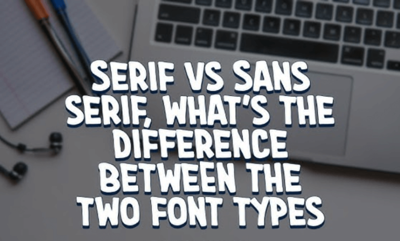
Serif fonts are a cornerstone of typography, offering both aesthetic appeal and functional readability. Characterized by small lines or extensions at the ends of their strokes, serifs have been utilized in print and digital media for centuries. In this article, we’ll explore the different categories of serif fonts, their historical evolution, and highlight some notable examples, particularly from the TypeType collection.
What Are Serif Fonts?
Serif fonts are typefaces that feature small lines or decorations at the ends of their letter strokes. These embellishments can vary in style—from thin and straight to thick and bracketed—adding a distinctive character to the text. Serifs are believed to enhance readability, especially in printed materials, by guiding the reader’s eye along the lines of text.
Categories of Serif Fonts
Old Style Serifs
Emerging in the 15th to 17th centuries, Old Style serifs are inspired by handwritten scripts. They typically feature slanted ovals and asymmetrical serifs. An example from the TypeType collection is TT Bells, which combines the charm of Old Style fonts with modern geometric design elements.


Transitional Serifs
Transitional serifs bridge the gap between Old Style and Modern serifs. They exhibit higher contrast between thick and thin strokes and more vertical stress. TT Marxiana, inspired by pre-revolutionary Russian typography, is a notable example that reflects this transitional phase.
Modern Serifs (Didone)
Modern serifs, or Didone, emerged in the late 18th century, characterized by high contrast between thick and thin strokes and flat serifs. TT Barrels is a contemporary interpretation of this style, combining elegance with industrial design elements.
Slab Serifs
Slab serifs, popularized in the 19th century, are known for their thick, block-like serifs and low contrast. They are often used in headlines and posters for their bold presence. TT Rationalist is a modern slab serif that exemplifies this robust style.
See also: Best Dentist NYC Techniques for Pain-Free Treatment: Innovations in Dentist NYC
Notable Serif Fonts from TypeType
TypeType, a renowned type foundry, offers a diverse range of serif fonts catering to various design needs:
- TT Livret: A versatile serif family with three subfamilies—text, display, and subheading—designed for optimal readability and aesthetic appeal.
- TT Espina: A display serif with expressive serifs and high contrast, suitable for headlines and decorative purposes.
- TT Norms® Pro Serif: A universal text serif developed as a complement to the TT Norms® Pro sans serif, offering excellent legibility in both print and digital formats.
- TT Ricordi: A collection of six display headline serifs, each with a unique character, ideal for making a bold statement in design projects.
Choosing the Right Serif Font
When selecting a serif font, consider the following factors:
- Purpose: Determine whether the font is for body text, headlines, or decorative elements.
- Readability: Ensure the font maintains clarity, especially in smaller sizes.
- Tone: Match the font’s style to the desired mood or message of the project.
- Compatibility: Check if the font supports the necessary languages and characters for your project.
Conclusion
Serif fonts continue to play a vital role in typography, offering a blend of tradition and modernity. Whether you’re designing a classic book layout or a contemporary website, understanding the nuances of serif fonts can enhance the effectiveness of your design. Exploring collections like those from TypeType can provide a wealth of options to suit various design needs.